ESSAY · 2026-06-07
Designing Hint Systems — How to Show, How to Hide
The grammar of hints that don't over-teach, from InvisiClues to The Case of the Golden Idol
Introduction
The finger hesitates a little before opening a walkthrough tab. What the player wants is not the answer but a single confirmation: am I thinking in the right direction? Yet search results hand over the full solution without mercy. This gap between how much you want to know and how much you are given is, I think, the real problem hint design has to solve. A hint is not a dial for lowering difficulty. It is delicate information design meant to dissolve the stuck point without stopping the thinking.
This essay traces the lineage of showing and hiding: the staged disclosure Infocom achieved on paper in the 1980s, the silence of The Witness, the deliberate friction of The Case of the Golden Idol, and the answer-checking Return of the Obra Dinn dissolved into its structure. Shaping the Learning Curve dealt with where to make players stop; this is its sequel. What do you do with a player who has already stopped? I want to sort that out from a maker's view.
Staged Disclosure on Paper — The Invisible Ink of InvisiClues
The prototype of hint design exists on paper, before anything digital. In the early 1980s, Infocom sold hint booklets called InvisiClues alongside its text adventures. Beneath each question sat several answers printed in invisible ink; rubbing them with the included marker revealed one line at a time. The first line was a whisper, something like 'have you searched that room again?', each further rub grew more specific, and only the final line gave the solution itself. The booklets reportedly sold over half a million copies by late 1984, which tells you how large the demand from stuck players really was.
The genius of InvisiClues was handing the unit of disclosure to the player. You decide how far to rub. The freedom to read one line and close the booklet was physically guaranteed. This is an almost complete prototype of what modern hint systems try to recreate on screen. Staged disclosure, self-determination, even the regret of having revealed too much: paper knew all of it forty years ago. In some ways it was more refined than the wiki page that spoils everything in a single scroll.
Declaring No Hints — The Silence of The Witness
On the other side stands the design that places no hints at all, and it is a coherent philosophy. 2016's The Witness has no hint feature and not even a line of text explaining its rules. Jonathan Blow made the sequence of panels itself the teacher, absorbing the need for hints into the grammar. Stephen's Sausage Roll, from the same year, keeps the same silence. Being stuck is the spec; walking away for a few days and coming back is part of the experience. You can almost hear the designers saying it.
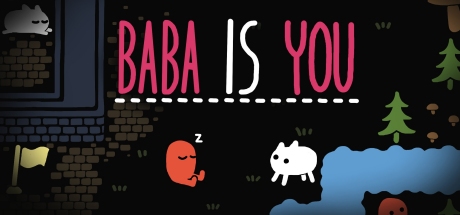
But a game's silence does not mean the absence of hints. 2019's Baba Is You ships no official hint feature, and as if to fill that void, its community has maintained hint guides with carefully staged spoiler levels. When a game refuses to hint, the work of hint design gets outsourced to the player community. I read this as division of labor rather than abdication, but the author cannot control the quality of outsourced hints. Choosing silence means accepting the modern environment where one search surfaces the full solution.
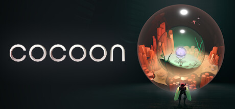
The most honest form of silence is building a board so legible that hints become unnecessary. 2023's Cocoon has no hint feature, yet it carries most players through its six hours without letting them stall, erasing the need for hints through the precision of its visual affordances. A design with no hints looks aloof, but it is often the design that has thought hardest about hinting.
Hints with Friction — Golden Idol's Extra Step and A Monster's Expedition's Open Door
The third road places hints but builds deliberate friction into them. In 2022's The Case of the Golden Idol, you cannot read a hint until you solve a small word-and-picture matching task, every single time. That one step, which prevents casual mashing, makes players re-ask themselves whether they really need a hint right now. And what appears is never the answer, only a steering of the gaze: where to look, whose testimony to doubt. The whole system is tuned so that the feeling of having solved it yourself survives the hint.
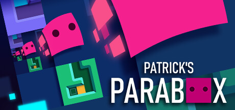
2020's A Monster's Expedition showed the opposite solution. Updates added optional hints and went further, allowing puzzles to be skipped outright. Draknek & Friends' accessibility stance is plain: better to let players skip and keep traveling than to lose them to a wall. In the context of subtractive design the weight of a single move is the value, but what this game sells is the comfort of island-hopping, not the pride of solving everything unaided. It is a fine example of friction being tuned up or down by what the work is selling.
What interests me in friction design is the currency of the cost. Golden Idol charges a small chore, InvisiClues charged the physical act of rubbing a marker, and the walkthrough site charges the faint guilt of switching tabs. All of them delay access to the hint by just a moment, making the player choose again whether to keep thinking. Like the cost design of trials I wrote about in The Ethics of Undo, the cost design of hints is a declaration of stance toward the player.
Hints Built into Structure — Obra Dinn's Rule of Three and Sennaar's Checkpoints
Finally there is the way of taking hints out of the menu and embedding them in the structure of the game itself. The rule in 2018's Return of the Obra Dinn that fates lock in three at a time is, beneath the deduction game, a precision hint mechanism. At the moment of confirmation the player is not told an answer; they are told that their method of reasoning was sound. The system structurally prevents the accident of building for hours on a wrong hypothesis, without using the word hint even once.
The verification notebook in 2023's Chants of Sennaar follows the same grammar. Hypotheses about unknown glyphs are checked against sketch pages once a few accumulate, and lock in when correct. Along a game of rising observational resolution, regular answer-checking stations are placed. The knowledge-based progression I described in Turning Looking into Play would be wandering in fog without such structural hints. Tunic in 2022 turning the strategy guide itself into an in-game collectible is the same idea taken to its conclusion: put the hints inside the world.
The strength of structurally embedded hints is that they spare the player's pride. Opening a hint from a menu always carries a small taste of defeat. But there is no defeat in Obra Dinn's confirmation flourish; it is the most satisfying reward in the game. The best hint is the one never recognized as a hint.
Closing
Laid side by side, hint design sorts into four options. The staged disclosure that paper InvisiClues established. The silence of The Witness, supported by a grammar legible enough to afford it. The friction of Golden Idol and the open door of A Monster's Expedition. And Obra Dinn's answer-checking dissolved into structure itself. Which is correct depends on what the work is selling, a conclusion that lands in the same place as the learning-curve series. A hint system is not a difficulty valve; it is a declaration of stance toward the stuck player.
If I were making a puzzle next, I would start by trying to embed hints into structure the Obra Dinn way, with no hint menu at all, and add Golden Idol-style friction hints only where that fails. The ideal is a game whose finishers remember it as having had no hints. I leave the reader a question: the last time you looked at a hint, was it really the answer you wanted, or just the confirmation that your thinking was not wrong?
Reactions (no login)
Anonymous • one of each per visitor per day
Read next
Part of these series